What should the market understand?
Clarify the category, audience, value proposition, and distinctive strengths the identity should reinforce.
LogicAide develops visual identity systems that connect positioning, logo use, color, typography, imagery, layout, and digital application into one consistent brand language.
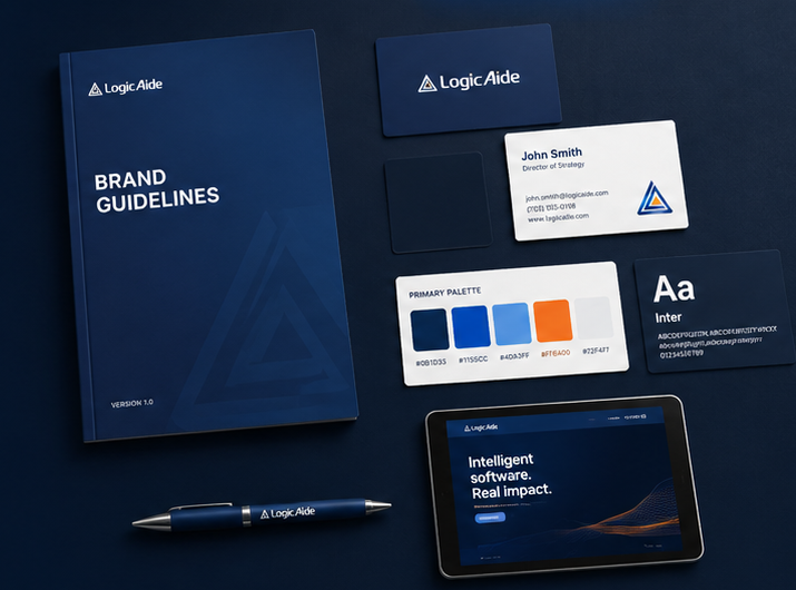
The visual system should express what the business stands for, who it is for, and how it wants to be perceived. Without that foundation, design becomes decoration instead of communication.
Clarify the category, audience, value proposition, and distinctive strengths the identity should reinforce.
Technical, premium, approachable, innovative, established, energetic, precise—or a deliberate combination.
The design language should match how the right customers evaluate credibility, quality, and professionalism.
Brand identity is more useful when every component is designed to work together across websites, social channels, documents, presentations, campaigns, and future applications.
Define how the identity appears in horizontal, compact, icon, light, dark, and small-format applications.
Recognition →Build a palette with defined roles for primary color, accents, backgrounds, contrast, and digital states.
Color logic →Define headline, body, supporting, and interface typography so the brand stays recognizable across formats.
Type system →Establish the image style, technical visuals, illustration direction, cropping, and treatment that support the brand.
Visual direction →Create reusable principles for spacing, grids, cards, dividers, accents, and page composition.
Composition →Document the rules clearly enough that future website, social, sales, and marketing work stays consistent.
Guidelines →Recognition grows when the same design principles appear repeatedly across every customer touchpoint. Color, type, spacing, imagery, shape, and tone should reinforce each other.
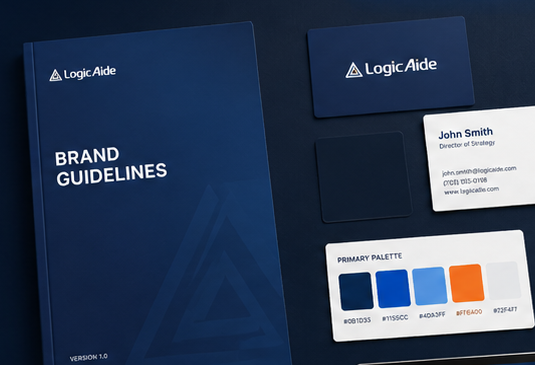
We evaluate how the identity behaves in actual customer-facing situations so the final system is usable, not just attractive in isolation.
Clear guidance reduces the need to redesign every asset from scratch. Teams can move faster because the decisions around color, typography, spacing, logo use, imagery, and visual tone have already been made.
Audience, positioning, competitors, current identity, goals, strengths, and where the brand needs to improve.
Personality, tone, references, design principles, differentiation, and the type of recognition the system should create.
Logo use, typography, color, visual language, imagery, layout rules, and digital applications.
Website sections, social graphics, sales materials, presentations, and other representative applications.
Package the rules and assets so future work stays consistent as the company grows.
Not always. A strong existing mark may only need refinement, improved usage rules, or a more complete visual system around it.
Yes. Positioning, visual identity, typography, color, imagery, and application can be modernized while the name remains unchanged.
Yes. Digital use should be part of the identity from the beginning, including responsive layouts, social graphics, interface use, contrast, and screen behavior.
Brand guidance can be included so future website, marketing, sales, and social materials remain visually consistent.
We can develop the brand system first, then apply it across the website and marketing channels.